It seems every US election cycle someone trots out analysis showing that equity market returns are strongly influenced by presidential politics. Indeed, historical returns appear to show that the “presidential cycle” has affected returns over the past century or so, but we would encourage investors to be skeptical of such claims, as we would with any one-factor model given differences between periods in valuations, economic activity, geopolitical concerns, investor attitudes toward risk, central bank actions, and any number of other issues. Further, given the generally stated reasons for the cycle—that politicians seek to “clean house” after getting elected, then ramp up spending prior to the next election—there are reasons to question whether such a theory still holds, as the lion’s share of government spending has shifted from discretionary to mandatory.
Whether or not “this time is different” due to the unusual nature of the upcoming US presidential election—with candidates widely called the “most disliked in history”—investors should cast a critical eye on claims that the presidential cycle will provide investment/trading opportunities.
The Theory
The premise for the presidential cycle is simple: as Yale Hirsch, former editor of Stock Trader’s Almanac, once explained, “I think a president is elected and tries to get rid of the dirty stuff in the economy as quickly as possible, so that by the time the next election comes around, he looks like a hero.” In addition, presidents have often attempted to boost spending prior to national elections to make the economy look better—studies have shown economic activity to be one of the most important factors, if not the most important, in presidential election results,[1]Perhaps most notably, Ray Fair’s prediction model, laid out in his 2009 paper, “Presidential and Congressional Vote-Share Equations,” Alan Abramowitz’s “Time for Change” model, and … Continue reading with the incumbent president’s party getting either the credit or blame. Looked at on a mean and median basis, as the chart below does, equity market returns have been best in years three and four of a presidency, with year three the clear standout (though not every year three—2015’s 1.4% return was far below average). Focusing on the market as a discounting mechanism, mean and median returns for the three months prior to elections (August through October) have been significantly better for investors in election years than in years with no national elections. Whether this is reflective of additional spending or pre-election excitement we cannot say, although it is worth noting that markets in 2008 were apparently unimpressed by the prospect of “Hope and Change.” We mean this in a tongue-in-cheek manner, but it does point out one of the main flaws of the model—the limited number of data points.
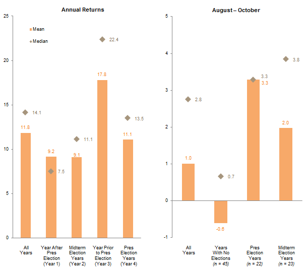
Average and Median S&P 500 Returns (Nominal) by Presidential Election Cycle
1926–2015 • Total Return (%)
Sources: Global Financial Data, Inc. and Standard & Poor’s.
Thus, while we agree the historical data suggest some sort of causal relationship when viewed as averages, such linkages seem less impressive on an individual basis. Were markets really excited for Bill Clinton’s 1996 reelection (10.8% return for the S&P 500 from August through October) but distressed over Barack Obama’s 2008 win (-23.1%)? How about 2000, when markets were flat going into George Bush’s win, then sold off the next year? Was the market just disappointed (or was it expecting Al Gore to win, given he did win the popular vote)? Then how to explain the solid 3% return going into Bush’s 2004 reelection? Or, perhaps, is this all just noise? Plotting not just the mean and median returns in these periods but the individual data points, as is done in the chart below, shows just how wide the range of returns has been. And in fact a statistical analysis of the annual returns shows that the standard deviation is so wide that even at a 70% confidence interval the relationship is not statistically significant. It reminds us of the old joke about the statistician who says he is comfortable “on average” with his head in the oven and feet in the freezer.

Average and Median S&P 500 Returns (Nominal) by Presidential Election Cycle
1926–2015 • Total Return (%)
Sources: Global Financial Data, Inc. and Standard & Poor’s.
From a partisan standpoint, Democrats often cite the far better returns during Democratic administrations as proof of better policies, while Republicans attribute the returns to market-friendly reforms made during prior Republican presidencies. (Libertarians, meanwhile, argue returns would be even better if they could ever get someone elected.) It is also true that Democratic administrations have increased spending at a greater average rate than Republican ones (see chart below), though, again, averages obscure differences between individual administrations, and of course it is Congress, specifically the House of Representatives, and not the President that has the “power of the purse.” In our opinion even less knowledge is to be gained from parsing returns by party than for the presidential cycle as a whole; simply too many other factors are at work—not to mention the fact that administrations from the same party can and do govern quite differently—to ascribe the difference in returns to anything but noise.

S&P 500 Returns and Government Spending Under Democratic and Republican Presidents
1921–2015 • Percent (%)
Sources: Standard & Poor’s and U.S. Department of Commerce – Bureau of Economic Analysis.
Notes: Years used to represent each administration are shown on the chart. Full calendar years are used for returns and spending although presidents do not take office until late January. Average annual spending data begin in 1930 (no spending data available until the second year of Herbert Hoover’s term). Average annual spending is based on current expenditures as calculated by the Bureau of Economic Analysis, and represents mandatory and discretionary expenditures. Interest payments and subsidies, two other categories of spending typically considered apart from mandatory and discretionary spending, have been excluded from this exhibit.
The Times They Are a-Changin’
While the theory behind the presidential cycle has some appeal, investors should approach with a healthy skepticism its claims as an investment strategy. This is especially true today given external factors and the changing composition of US government spending.
Consider first the changing role of central banks, which have evolved to occupy not only a preeminent role in markets, but often the only one worth paying attention to. The post-Brexit moonshot is simply the latest example of markets reacting not to news, earnings, or even actual actions by central bankers, but simply the expectation that central banks will once again ride to the rescue. In such a world, how much weight should investors assign to US presidential politics?
A little-noted fact of US government spending, meanwhile, is that its composition has changed dramatically over the past 65 years. In the early 1950s—i.e., prior to the Great Society and War on Poverty, and in the relatively early days of Social Security—the split between discretionary and mandatory spending significantly favored the former, with over three-quarters of spending discretionary.[2]These calculations use the US Bureau of Economic Analysis line items for discretionary and mandatory spending and exclude what they separately categorize as interest payments and subsidies, much of … Continue reading Today is the mirror image, with nearly three-quarters classified as mandatory. And given the widespread panning of recent spending initiatives such as George W. Bush’s 2008 “rebate checks” and Barack Obama’s 2009 “stimulus,” the prospect of a large increase in spending seems borderline inconceivable absent another economic crisis. (Although we must admit that Jeffrey Gundlach’s vision of a Trump administration debt binge feels oddly plausible.)
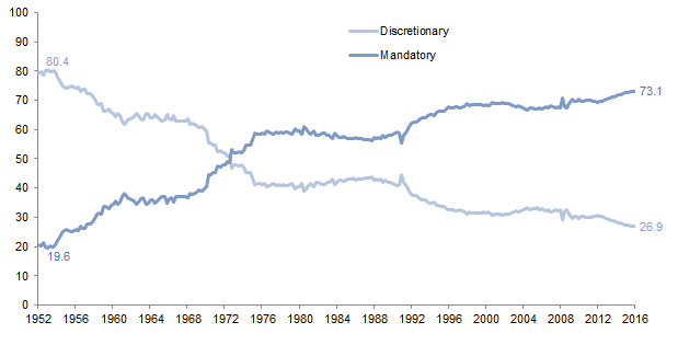
US Government Spending: Discretionary vs Mandatory
First Quarter 1952 – First Quarter 2016 • Percent (%) of Total Spending
Source: US Department of Commerce – Bureau of Economic Analysis.
Notes: Data are quarterly. Mandatory spending is represented by current transfer payment data, including government social benefits for people and transfer payments to state and local governments. Discretionary spending is represented by data on consumption expenditures. Interest payments and subsidies, two other categories of spending typically considered apart from mandatory and discretionary spending, have been excluded from this exhibit. Including them in mandatory spending shows a similar picture, with discretionary spending going from 71.2% at the peak to 23.5% today and mandatory spending going from 28.8% at the trough to 76.5% today.
The Futility of Predictions
Finally, while not specifically related to the focus of this paper, a word is due on the booming market for predicting what markets will or will not do based on who wins the election. Let us be very clear on this point: no one knows. This is true not only because presidents have far less influence on the economy and markets than generally believed, and (related) the plethora of other variables at play, but also because presidents can and do govern differently than expected. Thus, while partisans love to cherry pick administrations based on favorable data—according to Republicans, for example, Reagan won the Cold War, broke the back of inflation, and delivered a “peace dividend,” while Democrats like to say Bill Clinton “ushered in” the Internet boom—such claims are at the very least vastly oversimplified. It is also instructive that both narratives contrast sharply with pre-election caricatures of the candidates (Reagan was a crazy warmonger and Clinton a tax-and-spend liberal).
For more on this, see Eric Winig, “Brexit: Outlier or Harbinger?,” Cambridge Associates Research Brief, July 20, 2016.
Investors should also note that such predictions tend to dovetail with the analyst’s personal politics, with Clinton supporters preaching doom if Trump wins, and vice versa. Thus, predictions that a Trump victory would cause a market crash, or that a Clinton win would be bad for big banks and oil & gas companies, are about as reliable as those that said a vote for Brexit would cause the global economy to collapse.[3]Similarly, the scariest Brexit stories were penned by those firmly in the Remain camp.
All that said, it is possible that the unlikability of both candidates, coupled with an increasing number of negative pieces based on one or the other winning, could drive up market volatility as the election approaches. This is doubly true given markets’ recent complacency, which suggests most investors are not positioned for a “risk-off” outcome.
The Bottom Line
The presidential cycle may have exerted an influence on US equity markets over the past 100 years or so…or it may not have. Either way, the factors cited as reasons for its existence have weakened to the point where it strains credulity to believe it will have an impact on current markets. The idea that the president will boost spending and spark a market surge strikes us as something akin to the idealistic 1950s America summoned by Trump’s “Make America Great Again” slogan—i.e., an unlikely state of affairs that, while exerting a powerful hold on peoples’ imagination, never really existed quite that way in the first place.
Eric Winig, Managing Director
Brandon Smith, Investment Associate
Footnotes