Calendar year 2025 performance
Calendar year 2025 offered a strong market backdrop for foundations as the environment for risk assets was supported by several promising macroeconomic developments. Global economic growth remained resilient, inflation continued to moderate in many major economies, and central banks shifted toward easier monetary policy. At the same time, continued enthusiasm around artificial intelligence and related capital spending supported corporate earnings growth, particularly in equity markets tied to technology and other cyclical sectors.
It was a third straight strong year for public equity performance. However, unlike the previous two years, global ex US markets was the best performer in 2025. A weaker US dollar provided an extra boost to non-US assets in dollar terms, with both the MSCI EAFE Index and MSCI Emerging Markets Index returning more than 30% for the year (Figure 1). There were also several asset classes outside of public equities that offered solid gains. Perhaps most notably, the US and global versions of the CA Venture Capital Index posted their best returns since 2021 with both reporting internal rates of return (IRRs) of approximately 20%.
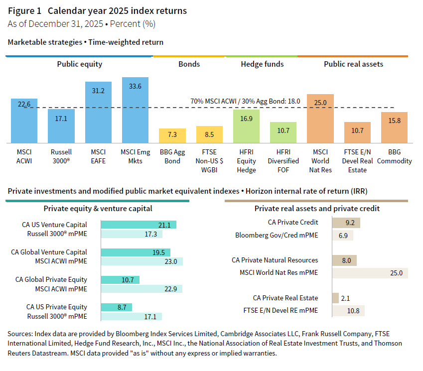
Fixed income markets also contributed positively to portfolio returns in 2025. The Bloomberg Aggregate Bond Index returned 7%, which was much improved compared to the previous year. With both equities and fixed income performing well, a blended index weighted 70% global equities and 30% fixed income returned 18%. This simple benchmark, while demonstrating how favorable the investing environment was over the past year, proved to be a tough bogey for diversified foundation portfolios to outperform. In fact, the blended index return landed toward the upper end of the top quartile for the overall foundation universe (Figure 2).
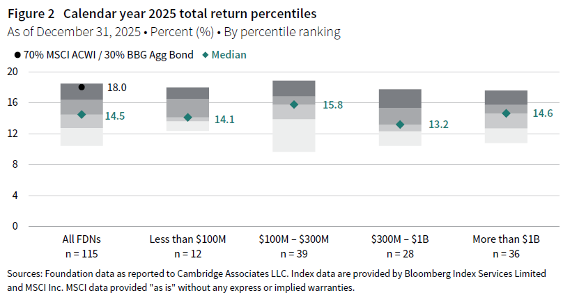
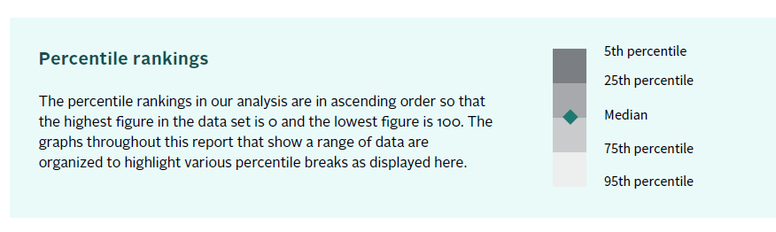
The median return among all foundations was 14.5% in calendar year 2025. The spread in returns from the 5th percentile to the 95th percentile was approximately 800 basis points (bps), which was slightly larger than the previous year, but still well below the levels of dispersion reported earlier in the 2020s. What was more notable was the absence of a clear relationship between foundation asset size and performance in 2025. The cohort of foundations between $100 million and $300 million reported the highest median return at 15.8%. However, the distribution of the dataset also shows that some of the lowest-returning portfolios in the overall universe also came from this subgroup.
Our first step in digging further into the comparative performance story is to look at differences in asset allocation structures among foundations. The key differentiator continued to be the breakdown in allocations between public equities and private investments. Top quartile performers clearly benefited from another strong year in global stock markets. On average, these foundations had half of their portfolios invested in public equities in 2025 (Figure 3). In contrast, the bottom quartile of performers had about one-third of their portfolios allocated to public equities, on average. Notably, the average allocation breakdown for the middle two quartiles was similar to the overall foundation universe mean not only in public equities, but across all strategies.
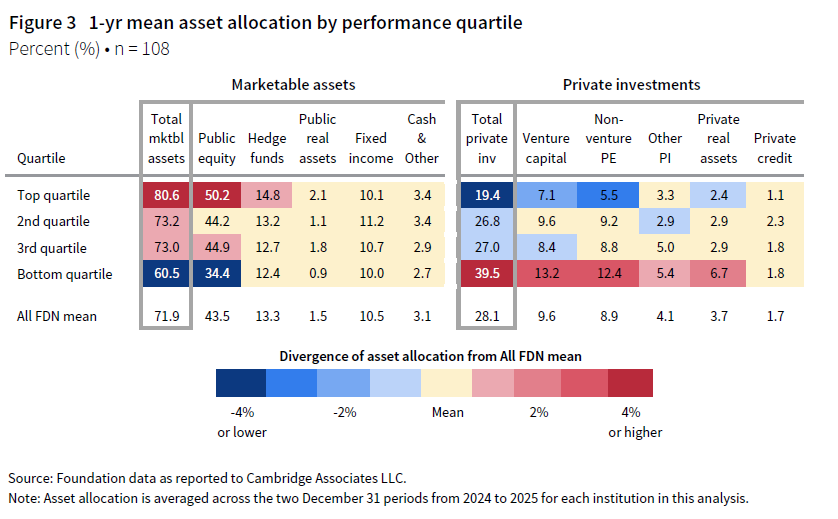
In Figure 1, we noted that venture capital had a bounce back year in terms of index performance. The CA US Venture Capital Index actually outperformed the modified public market equivalent version of the Russell 3000® Index by almost 400 bps in 2025. However, as we will show later in this section, most foundations earned returns from their venture investments that were far less than the index return. As a result, higher venture allocations did not automatically translate to peer group outperformance, with the bottom quartile of performers reporting an average allocation that was almost double that of top quartile foundations.
While differences in asset allocations explain some of the dispersion in peer returns in 2025, further analysis suggests that other factors played a bigger role. Our attribution analysis estimates how much of each foundation’s return could be explained by its asset allocation versus how much value was added through the implementation of the portfolio. Plotting both components versus total portfolio returns clearly illustrates that the implementation piece was the dominant driver in the dispersion in foundation returns in 2025 (Figure 4).
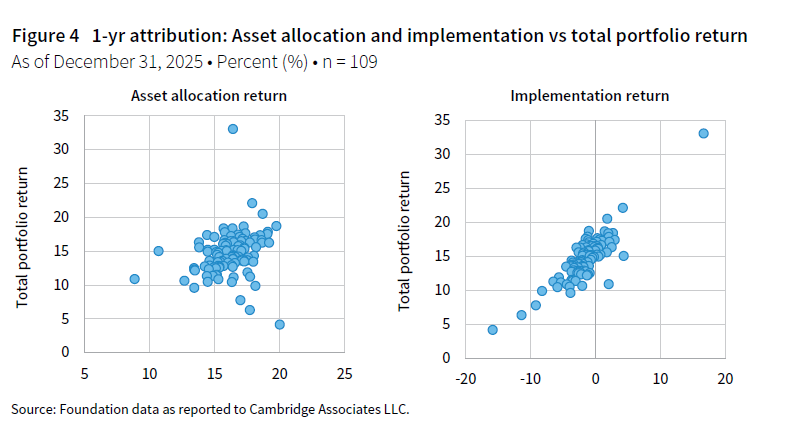
It is important to understand what exactly the two components of the attribution analysis represent. For each foundation, the asset allocation component is a blended return of representative asset class indexes that are weighted according to its beginning year asset allocation. The implementation return is simply the difference between the actual portfolio return and the asset allocation return. There are multiple things that can influence the implementation return estimated in our model, and it is impossible to precisely attribute every detail, given the level of data we gather in our surveys. However, a primary component is the alpha generated in portfolios. In addition, this category will capture the effects of style tilts that result in meaningfully different asset class exposure compared to the broad market benchmarks we use in the model.
Just 24% of foundations added value through implementation in 2025 according to our model. This means that the majority of foundations earned less than what they would have returned had they been invested in the asset class benchmarks over the course of the year. This is not an entirely practical exercise because there are not passive investment options for the alternative asset classes in our framework.[1]For a detailed list of asset class benchmarks in the attribution analysis, see the Appendix. However, the general takeaways from the attribution analysis are supported by performance statistics that foundations reported for their asset class composites.
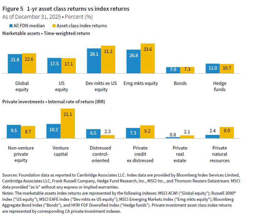
Overall, foundations found it challenging to generate alpha in 2025. In most strategies, the median return for foundations underperformed the representative asset class index used in the attribution analysis. The margins of underperformance were greatest in venture capital and emerging markets equity (Figure 5). The peer group fared better in US equities and non-venture private equity, where the median foundation return performed slightly better than the asset class benchmark.
Diversified portfolios continued the recent trend of underperforming a simple benchmark
A blended index weighted 70% MSCI ACWI and 30% Bloomberg Aggregate Bond Index is included in several of the analyses in this report. This 70/30 reference portfolio has long served as a useful yardstick in the evaluation of performance in the endowment and foundation world. The weightings of the simple portfolio bear a resemblance to the risk profile of many institutions from the perspective of how much is allocated to equities and equity-like assets. Further, the use of a passive, market-based measure helps contextualize the impact of asset allocation decisions to diversify into alternative asset classes. In years when both equities and bonds perform well, as in 2025, the benchmark sets a high bar for diversified portfolios to clear.
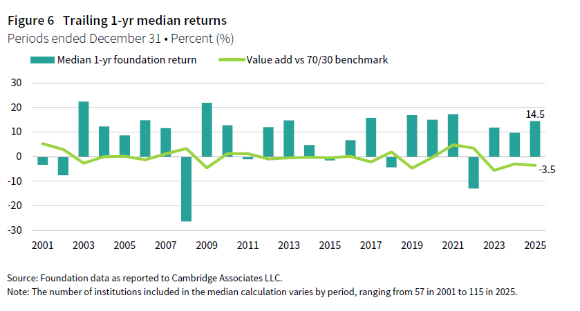
While many of the alternative asset classes delivered solid returns for the past year, they did not match up to the simple 70/30 option. Consequently, the foundation median underperformed the simple benchmark by 350 bps in 2025 (Figure 6). This was the third straight year that the median underperformed by significant margins. In fact, the first half of the 2020s has seen volatile swings in both directions in terms of the relative out/underperformance of the median versus the 70/30 benchmark.
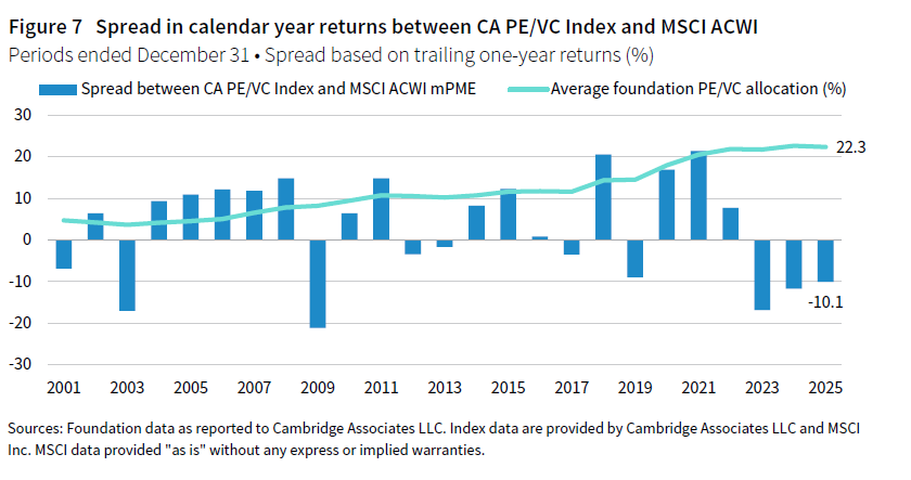
The dynamic between public and private equity market returns is usually the most important aspect to understand, as the majority of assets for most foundations tend to be allocated across these strategies. The IRR of the CA PE/VC Index was 10 ppts lower than the MSCI ACWI modified public market equivalent (mPME) in 2025 (Figure 7). It was the fifth time in the last six years that the spread between the two indexes extended into double-digit ppts. With the mean foundation allocation to PE/VC exceeding 20% in recent years, the large differentials between public and private market returns have had a major impact on the peer median return’s value add against the simple benchmark.
A key takeaway from the historical summary is that the last three years have been a very challenging environment from the perspective of relative performance versus the 70/30 benchmark. The foundation median lagged the simple measure by 390 bps on an annualized basis over this period, which was by far the largest degree of underperformance from the last 25 years (Figure 8). Further, just 9% of foundations earned a return that surpassed the benchmark over this most recent trailing three-year period.
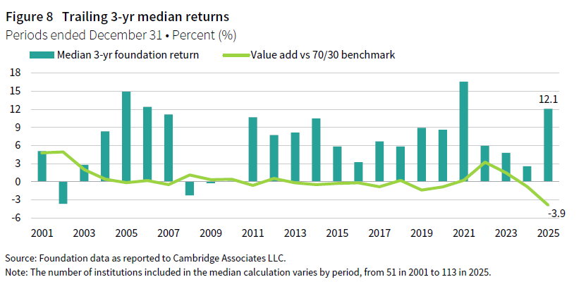
The picture was brighter when looking through the lens of absolute performance. The median peer return for the trailing three-year period, at 12.1%, was a substantial improvement over the figure reported in last year’s study. This year’s return was the fourth highest in the last 25 years. Further return data on this and other trailing periods are contained in the Appendix section of this report.
Long-term results were less dependent on private investments
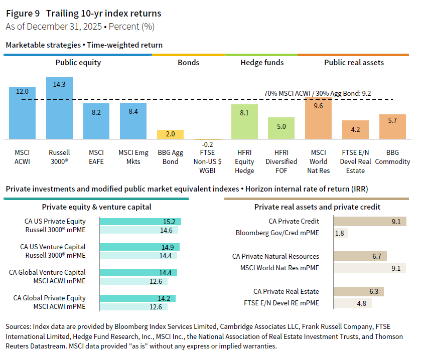
The longer-term performance narrative is noteworthy in how it compares to peer trends we have observed over much of the last generation. Specifically, the link between private investment allocation and peer performance rankings was much less pronounced for this most recent ten-year period. A comparison of asset class index returns shows thin margins between the CA PE/VC and mPME public indexes over the past decade. This was the case particularly in the US segment where returns for public and private equities both approached 15%. While bonds performed dismally during this period, global equities propelled the simple 70/30 benchmark return above 9% for the trailing ten-year period (Figure 9).
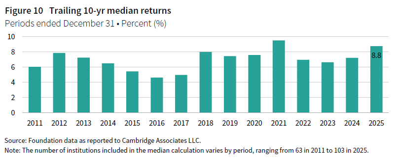
The strong performance from public and private equities alike provided an environment where most portfolios thrived regardless of the exact breakdown of their equity exposure. The median foundation return for the most recent ten-year period was 8.8%. This was one of the best long-term performance records reported across this past generation, second only to the ten-year period ending in 2021 (Figure 10).
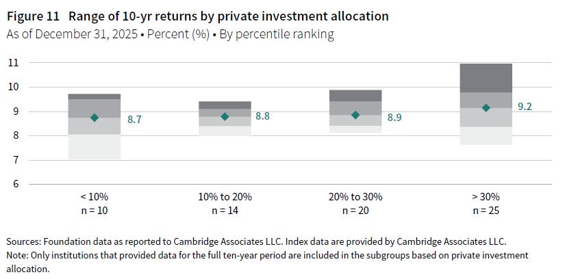
When the peer universe is split up by private investment allocation, foundations with more than 30% allocated had the highest median return at 9.2%. However, this cohort’s median return was just slightly higher than that of the other subgroups. In fact, it was just 50 bps higher than the group of foundations that had less than 10% of their portfolios allocated to private investments. In past years, it has not been uncommon for that margin to be as large as 200 bps or 300 bps (Figure 11).
Past studies have consistently shown that the range of returns earned by managers in private markets is much wider than the range of returns among public managers. These dynamics can boost portfolio returns for institutions whose private investment managers consistently deliver enhanced returns. Conversely, a private investment program with too many poor- or mediocre-performing managers can be a drag on portfolio returns. The peer results for the past decade capture this spectrum of experiences, as the range of returns was widest for the foundations with the highest private allocations. For example, seven of the top ten foundations in terms of ten-year performance were in this cohort with 30% or more allocated to private investments. On the other hand, there were also several in this group that were among the lowest-returning foundations in the universe over the past decade (Figure 11).
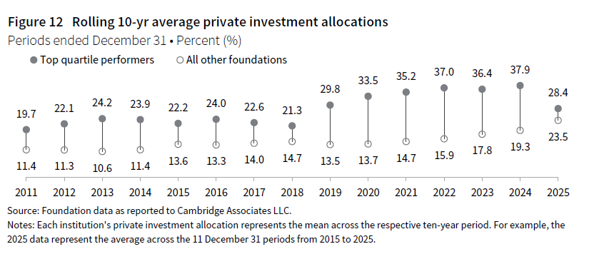
One final analysis captures how this most recent ten-year period stacks up to other historical periods. Top-performing foundations have consistently maintained higher private investment allocations compared to the rest of the universe. That relationship was especially strong for the rolling ten-year periods ending 2019 through 2024, with the average private allocation for the top quartile of performers sometimes being as much as 20 ppts higher than the average allocation for the remainder of the universe. However, that gap in allocations narrowed substantially in 2025—the average ten-year private investment allocation for top performers, at 28.4%, was just 4.9 ppts higher than the average for all other foundations. This was the smallest differential reported among the last 15 rolling historical periods (Figure 12).
Return to the Foundation Annual Investment Pool Returns: Calendar Year 2025 landing page to read other sections of this report.
Notes on the Data
The notation of n denotes the number of institutions included in each analysis.
Returns for periods greater than one-year are annualized.
The simple portfolio benchmark consisting of 70% MSCI ACWI/30% Bloomberg Aggregate Bond Index is calculated assuming rebalancing occurs on the final day of each quarter.
The MSCI indexes contained in this report are net of dividend taxes for global ex US securities unless otherwise noted.
Private indexes are pooled horizon IRRs, net of fees, expenses, and carried interest.
Hedge Fund Research data are preliminary for the preceding five months.
Profile of respondents
This report includes data for 115 foundations. The breakdown is as follows: 95 private nonoperating foundations, five private operating foundations, and 15 community foundations. All participants provided investment pool return and asset allocation data as of December 31, 2025.
The 115 participants in this study reported long-term investment portfolio (LTIP) assets as of December 31, 2025, totaling $255 billion. The mean LTIP size was $2.2 billion, and the median was $422.1 million.
12 participants have an LTIP size less than $100 million, while 36 have an asset size greater than $1 billion. The remaining 67 participants have an LTIP size between $100 million and $1 billion. The participants with LTIP sizes greater than $1 billion controlled 91% of the aggregate LTIP assets.
Modified public market equivalent indexes
Under Cambridge Associates’ modified public market equivalent (mPME) methodology, the public index’s shares are purchased and sold according to the private fund cash flow schedule, with distributions calculated in the same proportion as the private fund and mPME NAV is a function of mPME cash flows. The mPME analysis evaluates what return would have been earned had the dollars invested in private investments been invested in the public market instead.
Footnotes