The ‘canary down the coal mine’ that predicted the 2008 crisis is signaling another crash.
—Business Insider, January 2016, referring to the Baltic Dry Index
The Citigroup Economic Surprise Index is a strong contrarian indicator that is worth watching right now.
—The Wall Street Journal, January 2017
You keep using that word. I do not think it means what you think it means.
—Inigo Montoya (Mandy Patinkin) in the film The Princess Bride, 1987
How much faith can investors put in the signs given by various “predictive” indicators? The news media certainly love to give them attention—until, of course, they are shown to have given a false signal, and then it’s on to the next “better” predictor. In this brief, we look at five indicators that have been in vogue in recent years, and review their track record. Have they provided a good gauge of economic growth or an early signal of recessions? And, if they have, would that be of value in making equity investment decisions? In short, the answers are: not with any consistency, and no.[1]The indicators we review are often considered to have something to say about “global” economic health. Because there is no precise way to measure global recessions historically, in our analysis … Continue reading While news articles are unlikely to stop citing these indicators, we hope that this analysis will remind investors to keep their focus on fundamental analysis, rather than the purported “signal” given by one of these indicators.
Dr. Copper
Copper is used ubiquitously across industries. According to the Copper Development Association, average single-family homes in the United States consist of around 440 pounds of copper wire, valves, and tubes; typical US-built automobiles contain 50 pounds of copper. The red metal is sometimes called “Dr. Copper” because it purportedly has a PhD in economics—earned from its ability to predict economic health. The popular notion is that the copper price cycle has historically shifted in tandem with shifts in economic cycles and, with history dating back to World War II, it offers one of the longest periods to examine.
The doctor has given valid economic prescriptions in the past—sharp drawdowns in copper prices of between 17% and 38% preceded recessions in 1953, 1957, 1981, 2001, and 2007 by five to 19 months. Given that recessions are not officially “called” until six to 18 months after they begin, in these instances copper prices provided an early warning signal. However, this accounts for just five of the 11 post-war recessions. In the other cases, copper prices were steady or on their way up in the months heading into the recession. Copper price drops have also provided a number of false warning signals. Using six- or 12-month drops in copper prices of at least 17% (to proxy the signals copper provided in advance of the five recessions it “predicted”) suggests more than ten additional recessions should be added to the dataset. Copper prices have also twice seen sustained drawdowns of more than 50% without experiencing a recession. In the first instance, copper lost 54.6% from December 1994 to February 1999 as the S&P 500 Index soared. Prices then headed back up for nearly two years before falling into the 2001 recession. The second of these instances saw copper lose 53.7% from July 2011 through late 2015, while the US economy continued its expansion and the S&P 500 hit new high after new high.
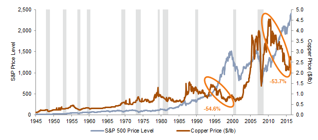
Relationship Between Copper Prices, US Recessions, and S&P 500 Price Levels
December 31, 1945 – May 31, 2017
Sources: Global Financial Data, Inc., National Bureau of Economic Research, and Standard & Poor’s.
Notes: Shaded areas represent US recessionary periods as defined by the National Bureau of Economic Research. Orange circles represent sustained copper price drawdowns of greater than 50% without experiencing a recession.
Purchasing Managers’ Survey
The Institute for Supply Management’s (ISM) Purchasing Managers’ Index (PMI) is another indicator with a long history. ISM’s PMI incorporates new orders, production, employment, supplier deliveries, and inventories in the manufacturing sector as part of its aggregate calculation. An index reading above 50 represents growth or expansion within the manufacturing sector, and a reading below 50 represents a contraction. The PMI is often quoted as providing an indication about the health of the economy.
Examining the 11 recessions that have occurred since PMI data begin, PMI readings turned negative one to seven months in advance of seven of them, and closely coincided with the start of three of the remaining four recessions. This appears to be a rather good track record. However, as the chart below shows, just like with Dr. Copper, false signals are common, having occurred multiple times in the 1980s, 1990s, and 2000s.
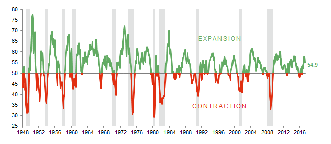
Relationship Between PMI and US Recessions
January 31, 1948 – May 31, 2017 • Index Level
Sources: Institute for Supply Management, National Bureau of Economic Research, and Thomson Reuters Datastream.
Notes: Shaded bars represent US recessionary periods as defined by the National Bureau of Economic Research. A PMI reading above 50 indicates an expansion in manufacturing activity and a reading below 50 indicates a contraction in activity.
Baltic Dry
The Baltic Dry Index (BDI) debuted in 1985 as a measure of global shipping rates on raw materials. To calculate its value, the index measures the costs of actually booking the shipments of such materials. The index provides insight into global demand for the materials, making it a proxy for worldwide trade and manufacturing activity.[2]Faqin Lin and Nicholas C.S. Sim, “Trade, Income, and the Baltic Dry Index,” European Economic Review, vol 59 (2013): 1–18. The metric’s popularity as a broad economic or market predictor soared after the global financial crisis, as the index plummeted 50% from October 2007 to January 2008, corresponding with what was later determined to be the beginning of a US recession and a 60% drop in US equities. But outside of this one period, what has its track record been?
Shortly after its introduction in 1985, the BDI bottomed in 1986. Just over a year later, the US stock market experienced the Black Monday crash of October 1987, but a recession did not occur until about three years later, in 1990. In early 1999, the BDI hit its lowest level since the end of 1986. The US stock market hit its peak just over one year later in 2000, and recession followed the next year. Although both of these examples can support a compelling story, the lag time between the BDI lows and the observed recession periods is lengthy.
After hitting post-1986 lows in 2008, the index dropped below those lows in 2012, and then sunk to new all-time lows in 2015 and 2016, prompting sensational headlines about the significance of these readings. If the BDI was a reliable leading indicator, each low should have predicted an imminent economic meltdown. As we know, it hasn’t, and US equities have continued to soar. Importantly, the BDI is not just a measure of shipping demand; it also measures the supply of vessels.[3]S.W., “Why the Baltic Dry Index Is at an All-Time Low,” The Economist, March 10, 2015. A rapid increase in Chinese shipping completions from 2006 to 2011 flooded the market with supply, impacting the calculated value of the index.
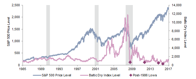
Relationship Between Baltic Dry Index Levels, US Recessions, and S&P 500 Price Levels
May 1, 1985 – May 31, 2017
Sources: Baltic Exchange Ltd., National Bureau of Economic Research, Standard & Poor’s, and Thomson Reuters Datastream.
Notes: Data are daily. Shaded areas represent US recessionary periods as defined by the National Bureau of Economic Research.
Economic Surprise Index
The Citigroup Economic Surprise Index measures economic data surprises relative to expectations—a positive reading indicates economic releases have beat expectations, while a negative reading indicates releases have been worse than expected—and has made headlines when it moves significantly in either direction. The index does not measure how good or bad economic data have been. Rather, it measures economic data relative to what economists forecasted. Citigroup updates the index on a daily basis, placing more weight on more recent, high-impact economic data in its calculations.
Given US Economic Surprise Index data only begin in 2003, the history is far shorter than the other “predictive” indicators we’ve examined so far, and only one official recession has occurred in that time. Can the index tell investors anything about equity market moves? Is it really a strong contrarian indicator worth watching, as often suggested in the news? The results of our analysis show that it is not. Neither positive nor negative Citigroup Economic Surprise Index readings give an indication of near-term (three- or six-month) subsequent equity performance.
Despite our finding that there is no predictive relationship between the Citigroup Economic Surprise Index and equity returns, we have seen analyses that suggest strong coincident relationships over specific time periods. Although torturing the data can make coincident relationships appear, the results are inconsistent and don’t provide any value for forecasting returns. The Citigroup Economic Surprise Index is not meant to be used as a signal for stock prices—Citigroup itself has cautioned investors about drawing conclusions from the index.[4]David Keohane, “Citi Says it’s Best Not to Get Carried Away by Citi’s Surprise Index,” Financial Times, May 8, 2017.
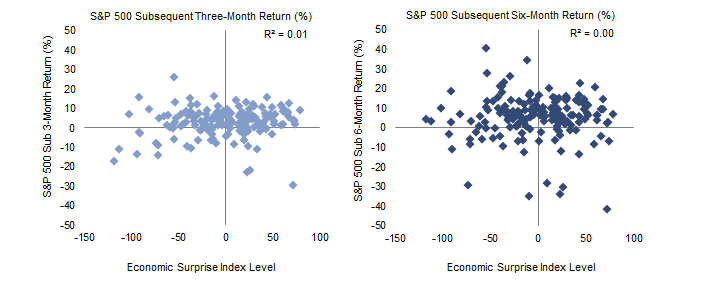
Relationship Between Citigroup Economic Surprise Index and Subsequent S&P 500 Performance
May 1, 1985 – May 31, 2017
Sources: Bloomberg L.P., Citigroup Global Markets, and Standard & Poor’s.
Leading Economic Indicators
The Conference Board® publishes the Leading Economic Index® (LEI), which is composed of ten leading indicators viewed as the “key elements in an analytic system designed to signal peaks and troughs in the business cycle.”[5]For more information, please refer to the Global Business Cycle Indicators Technical Notes, released by The Conference Board ® on a monthly basis. Even more detail on the calculation of aggregated … Continue reading
An examination of every instance where the LEI dropped below zero over rolling six-month periods for consecutive months shows that the LEI has accurately predicted every recessionary period since 1970, with lead times ranging from five to 20 months. This suggests LEI does have some power in predicting US recessions, but we must point out two key caveats. First, in addition to predicting each official recession in the past 60 years, the index has also predicted four more. This reminds us of Paul Samuelson’s famous quip, “the stock market has called nine of the last five recessions.” And indeed, S&P 500 stock prices are one component of the index.
Second, and perhaps more importantly, The Conference Board® occasionally retroactively revises the components in the index to give it a better fit to history, which makes studying the accuracy of historical LEI signals misleading. In March 1988, The Wall Street Journal referred to the LEI as an “antiquated, irrelevant index,” citing heavy weights to M2 money supply and overly simplistic techniques for tracking the economy. The index has clearly changed since then, now excluding money supply and using a more complicated process for construction. Comprehensive revisions to the index occurred in 1996 and 2011, while other methodological adjustments were made in 2001 and 2005. In its latest comprehensive revision release in 2011, The Conference Board® noted that the revisions were made “to address structural changes that have occurred in the US economy in the last several decades.” In these revisions, the entire history or portions of the history change, so the data we can chart today is not the data investors would have had in real time.
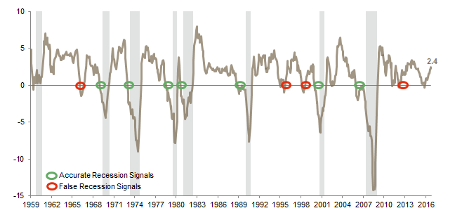
Relationship Between Rolling Six-Month Percentage Change in the LEI and US Recessions
July 31, 1959 – April 30, 2017 • Percent (%)
Sources: The Conference Board®, National Bureau of Economic Research, and Thomson Reuters Datastream.
Notes: Shaded areas represent US recessionary periods as defined by the National Bureau of Economic Research. Circles are shown for instances of two or more consecutive months of negative six-month percentage changes.
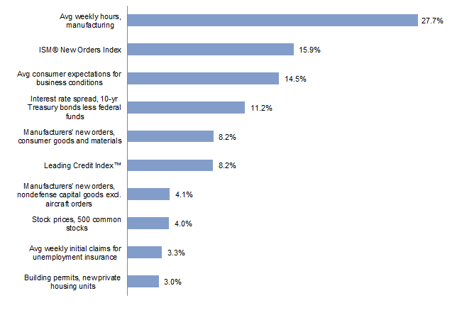
The Conference Board Leading Economic Index® Factors
As of May 18, 2017
Source: The Conference Board®.
Notes: The component factors are inversely related to the standard deviation of the month-to-month changes in each component. They are used to equalize the volatility of the contribution from each component and are “normalized” to sum to 100%. When one or more components are missing, the other factors are adjusted proportionately to ensure that the total continues to sum to 100%.
The Bottom Line
It’s no surprise that none of the common indicators reviewed in this analysis predict the future. Each has offered false signals that could lead to misjudgments about market conditions and result in risky market timing decisions. Periodic success by one indicator or another in “predicting” a recession or a stock market fall does not create a meaningful signal on which to make investment decisions. We don’t know what indicator will grab headlines tomorrow, but attempting to time the market based on popular indicators alone is a certain way to miss the whole story.
Sean Duffin, Manager, Capital Markets Research
Brandon Smith, Investment Associate
Footnotes